Wednesday, August 7, 2024

20th Century Architecture in Japan

Introduction

Today, we will be diving into some architecture located in Japan. Japan has many different building designs that I have not seen mimicked here in the United States very often. They have their own style and way of doing things. In Japan, many different materials are used in building just as we use in the United States. According to "Kiyonori Kikutake: Structuring the Future”, “Reinforced concrete therefore was the default choice and central focus of technological experimentation” (Mulligan, Mark). The first thing to notice is that a lot of their buildings look very strong as if they were built to be able to take whatever is thrown at them. According to, “Why does Japan have so many earthquakes and tsunamis?”, “Japan is no stranger to earthquakes. In fact, it’s among the most seismically active countries in the world and the birthplace of seismology, or the study of earthquakes. The study of tsunamis (the word in Japanese means harbor and wave) began here as well.”

Hotel Tokoen

Photo from hiddenarchitecture.com

The first piece of architecture that we will be looking at is Hotel Tokoen, located in Yonago, Japan. This piece of architecture is incredibly impressive. From the landscaping outside to the penthouse on top. Almost every level is different, this is an easy building to sit and admire. According to “Hidden Architecture”, “The Hotel Tokoen opened in 1952, and by the time Kikutake was commissioned to design what would become its new main wing, replacing the original entrance, the site already featured guest rooms and communal baths designed by Isao Shibaoka and a strolling garden designed by Masayuki Nagare.” The hotel was completed in 1964, and it is beautiful. 

Spiral

Photo from architecture-history.org

The next piece of architecture that we will take a look at is the Spiral in Tokyo, Japan. This is yet another incredible piece of architecture, specifically focusing on the “Spiral” inside. According to “Spiral”, “This is encircled by the spiraling 15-meter diameter ramp to the upper level that gives the building its name, and in addition to its anticipated use as an art gallery this soaring space quickly became a favorite venue for fashion shows and receptions because of the filming and people-watching possibilities provided by the ascending surface.” The spiral was designed by the Wocoal Group in 1985, it had to be a difficult design as it appears the ramp has no supports and is sort of floating in place. The exterior of the building is incredible as well, it displays many different designs and still shows the strength that we have seen in the Hotel Tokoen.

Church of the Light

Photo from archdaily.com

The last piece of architecture that we are taking a look at is the Church of the Light in Osaka, Japan. This design is fascinating, I have never seen a church or even a building similar to this. It seems to be a very simple design, basically just a concrete box with a cross on the wall where light can shine through. It is hard to miss the strength aspect of the Church of Light as it is all reinforced concrete. The Church of Light was designed by Tadao Ando and was completed in 1999. (Kroll, Andrew) 

Art Elements

The first art element that I would like to discuss is space. All of these buildings have great detail, even the Church of Light, the great detail that was used in perfecting all of the reinforced concrete to give it that smooth look we see. Every bit of space used with the Hotel Tokoen is incredible, outside and inside, they did not miss anything. Very strong lines are also used in all three of these buildings, really showing their strength. 

Discussion

All of these pieces of architecture impress me, but my favorite has to be the Hotel Tokoen. I cannot get over all the different levels and I particularly like the concrete pillars throughout the inside. It is incredible how much work goes into all of these buildings to make sure they can withstand almost anything. 

Works Cited

Hidden Architecture. “Hotel Tokoen.” Hidden Architecture, 15 Feb. 2022, hiddenarchitecture.net/hotel-tokoen/.

Kroll, Andrew. “Ad Classics: Church of the Light / Tadao Ando Architect & Associates.” ArchDaily, ArchDaily, 6 Jan. 2011, www.archdaily.com/101260/ad-classics-church-of-the-light-tadao-ando.

Mulligan, Mark. “Kiyonori Kikutake and the Architecture of Postwar Japan.” Places Journal, 1 Nov. 2015, placesjournal.org/article/kiyonori-kikutake-structuring-the-future/?cn-reloaded=1.

Spiral, architecture-history.org/architects/architects/MAKI/OBJECTS/1985,%20Spiral,%20Tokyo,%20JAPAN.html. Accessed 7 Aug. 2024.

Why Is Japan so Prone to Earthquakes and Tsunamis? - The Washington Post, www.washingtonpost.com/world/2024/01/03/japan-earthquake-reason-2024-tsunami/. Accessed 7 Aug. 2024.


Thursday, August 1, 2024

Up and Up with the Architecture

Introduction

In today’s blog, I will be highlighting six skyscrapers from the mid-modern era. The mid-modern era is known for its innovation, and this is well represented in its architecture. Everyone seems to love that mid-century modern look, especially today. If you are unfamiliar with the mid-century modern style, according to an HGTV article, “Midcentury homes are characterized by minimal fuss and ornamentation, along with sleek lines juxtaposed by organic shapes. Its look was a complete departure from the century’s earlier ornate and extravagant design” (Colleen). As much as I love the mid-century modern style, today I will be focusing on the skyscrapers from the whole mid-modern era.

Transamerica Pyramid

The first skyscraper we are taking a look at is the Transamerica Pyramid in San Francisco, California. Construction of the Transamerica Pyramid began in 1969 and it was completed in 1972. This skyscraper was designed by the architect William Pereira. This incredible skyscraper towers over everything else around it. (Heritage, SF)

Photo from sfheritage.org

Lever House

The next skyscraper we are taking a look at is the Lever House in New York. The Lever House began construction in 1950 and was completed in 1952. The lead architects in charge of the Lever House were Gordon Bunshaft and Natalie de Blois. (Agency, Wise Creative)

Photo from wikipedia.org

Canadian Pacific Plaza

The Canadian Pacific Plaza is a skyscraper in Minneapolis, Minnesota and was built in 1959. According to the article “Minneapolis’s First Midcentury-Modern Skyscraper”, the Canadian Pacific Plaza “was designed by the Chicago firm Holabird, Root & Burgee, with the Minneapolis firm Thorshov & Cerny” (Hudson, Chris). 

Photo from entermn.com

Seagram Building

The Seagram Building is located in New York. The construction of this skyscraper began in 1954 and was completed in 1958. It was designed by Ludwig Mies van der Rohe. (Seagram Building)

Photo from Architectuul


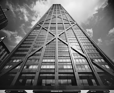
John Hancock Center

The John Hancock Center is located in Chicago, Illinois. This amazing skyscraper’s construction was completed in 1969. This piece of architecture “was designed by chief designer Bruce Graham and structural engineer Fazlur Khan” (John Hancock Center).

Photo from Architectuul

Marina City

The last skyscraper we will be taking a look at is Marina City in Chicago, Illinois. Construction on this Skyscraper was completed in 1967 and the architect responsible is Bertrand Goldberg. This impressive piece of architecture consists of two towers. (Marina City) 

Photo from architecture.org

Art Elements

In all of these incredibly impressive pieces of architecture, we see the use of line, space, and three-dimensional form. Line is an art element that plays a huge part in architecture especially seen in these skyscrapers, adding to their strength and showing how big they are. We see lines in these skyscrapers in many different ways, from horizontal and vertical lines to lines showing some of the structural aspects, and even some lines used for the design. Look at how the art element of space is used, most of the space taken up by these skyscrapers is straight up. At the bases, we see how not much space is taken up in comparison to how far they go up.

Discussion

There is a lot that can be said about these skyscrapers, they are all impressive and it is amazing that a building can be made so tall and some with small bases. It makes you feel for the architects, engineers, and designers. They have such an important job making sure everything is structurally safe and sound. If I had to choose a favorite skyscraper from the mid-modern era, it would certainly be Marina City. The design is incredible, and it makes this piece of architecture stand out from the rest.

Works Cited

Agency, Wise Creative. “Lever House: History, Architecture, and Facts.” Buildings DB, buildingsdb.com/NY/new-york/lever-house/. Accessed 1 Aug. 2024.

Heritage, SF. “San Francisco’s Mid-Century Modern Skyscraper Turns 50.” San Francisco Heritage, 2 May 2023, www.sfheritage.org/news/san-franciscos-mid-century-modern-skyscraper-turns-50/.

Hudson, Chris. “Minneapolis’s First Midcentury-Modern Skyscraper.” ENTER, ENTER, 14 Jan. 2024, www.entermn.com/articles/minneapolis-first-midcentury-modern-skyscraper.

“John Hancock Center.” Architectuul, architectuul.com/architecture/john-hancock-center. Accessed 1 Aug. 2024.

“Lever House.” Wikipedia, Wikimedia Foundation, 15 July 2024, en.wikipedia.org/wiki/Lever_House

“Marina City.” Buildings of Chicago | Chicago Architecture Center, www.architecture.org/learn/resources/buildings-of-chicago/building/marina-city/. Accessed 1 Aug. 2024.

“Seagram Building.” Architectuul, architectuul.com/architecture/seagram-building. Accessed 1 Aug. 2024.

Sullivan, Colleen. “Midcentury Modern Style 101.” HGTV, HGTV, 12 Jan. 2022, www.hgtv.com/design/decorating/design-101/midcentury-modern-style-101.


Monday, July 22, 2024

Early Modern Era - Innovations in Science and Technology

Introduction

During the early modern era, we saw some great innovations in science and technology. According to, “Great 20th Century Invention Timeline 1900 to 1949”, this time is known as, “the beginning of a century of innovation.” So many things were invented during this time, there is no way to list them all. Something that was affected by the innovations of science and technology during this time was architecture. In this blog, I will be displaying three pieces of architecture from the early modern era that highlight the innovations of science and technology. 

Chrysler Building


Photo from chryslerbuilding.com

The first famous piece of architecture that we will be taking a look at is the Chrysler Building, which if you have seen Spiderman, you may be familiar with it. According to the Chrysler Building’s website, “The story of the Chrysler Building began in 1928, when automotive titan Walter P. Chrysler, founder of Chrysler Corporation, bought the property from Coney Island developer William H. Reynolds for $2 million. Chrysler hired architect William Van Alen, who had previously designed a skyscraper for Reynolds on the site, to create the world’s tallest tower. Construction on Chrysler’s project began in 1929 and was completed in 1930” (History: Chrysler Building). The Chrysler Building was known to be the tallest building in the world until 1931 and is located in New York. This era's advances in science and technology must have played a part in designing and building a building of this size and detail. 

The Hoover Dam

Photo from hoover.archives.gov

The next amazing piece of architecture that we will dive into is The Hoover Dam located on the Nevada-Arizona border. The Hoover Dam is an incredible work of architecture and certainly displays this era's innovations in science and technology. According to the Hoover Dam’s website, “Appropriations were approved and construction began in 1930. The dam was dedicated in 1935 and the hydroelectric generators went online in 1937. Hoover Dam was built for a cost of $49 million (approximately $760 million adjusted for inflation). The power plant and generators cost an additional $71 million. The sale of electrical power generated by the dam paid back its construction cost, with interest, by 1987” (The Hoover Dam). The Hoover Dam has been incredible, it controls the Colorado River flooding, provides water to land and people, and it also provides energy. (The Hoover Dam) This was certainly not an easy design, and it serves many great purposes which make this piece of architecture even more impressive. 

Einstein Tower


Photo from archdaily.com

Last but not least, we will be reviewing the Einstein Tower, located in Potsdam, Germany. According to Arch Daily, “The Einstein Tower, designed by the German architect Erich Mendelsohn, is one of the best-known examples of German expressionist architecture. Designed as an amorphic structure of reinforced concrete, Mendelsohn wanted the tower to represent as well as facilitate the study of  Einstein’s radical theory of relativity – a groundbreaking theorem of motion, light and space” (Merin, Gili). This is an interesting piece of architecture that was built in 1921. The design is very different from anything else we have viewed, and it is an observatory. The use of reinforced concrete is incredible during this time, surely this tower is able to withstand anything nature may throw at it. 

Art Elements

The art elements seen in all three of these pieces of architecture are line, space, and three-dimensional form. We see lines used greatly in the Chrysler Building, it has line work seen throughout the building, as it towers over New York. The Hover Dam is also very large, showing its three-dimensional form and line work throughout. The way the Hoover Dam was designed is incredible and the architects had to have paid a lot of attention to detail in perfecting this work. The Einstein Tower also showcases line work throughout, especially around the windows and entrances. Notice all the details in the Einstein Tower, everything has a curve to it.

Discussion

All three of these pieces are very different to analyze. The Chrysler Building as a giant tower, the Hoover Dam as a large dam, and the funny-looking Einstein Tower. I enjoy each of these pieces in their own way and they all follow the theme of innovations in science and technology from the early modern era.   

Works Cited

Bellis, Mary. “Great 20th Century Inventions from 1900 to 1949.” ThoughtCo, ThoughtCo, 29 May 2024, www.thoughtco.com/20th-century-timeline-1992486#:~:text=The%20Zeppelin%20was%20invented%20by,Owens.

“History: Chrysler-Building.” Chrysler, chryslerbuilding.com/history/#:~:text=Chrysler%20hired%20architect%20William%20Van,and%20was%20completed%20in%201930. Accessed 22 July 2024.

“The Hoover Dam.” National Archives and Records Administration, National Archives and Records Administration, hoover.archives.gov/hoover-dam. Accessed 22 July 2024.

Merin, Gili. “Ad Classics: The Einstein Tower / Erich Mendelsohn.” ArchDaily, ArchDaily, 14 July 2013, www.archdaily.com/402033/ad-classics-the-einstein-tower-erich-mendelsohn.

Monday, July 15, 2024

Neo-Gothic & Neo-Classical - Romantic Era

Introduction

Today, we will be taking a look into the Romantic Era, where we will see some more impressive works of architecture. The two styles that we will be focusing on are the Neo-Gothic style and the Neo-Classical style. 

Neo-Gothic Style

The first piece of architecture that we will be focusing on from the Neo-Gothic style is the Houses of Parliament which is also known as the Palace of Westminister, in London, England. According to the UK Parliament, “One of the most recognised buildings in the world, the Palace of Westminster owes its stunning Gothic architecture to the 19th-century architect Sir Charles Barry. Now Grade I listed, and part of an UNESCO World Heritage Site, the Palace contains a fascinating mixture of both ancient and modern buildings, and houses an iconic collection of furnishings, archives and works of art” (Architecture of the Palace - UK Parliament). The Palace had to be rebuilt after a fire and the construction of the new Palace, designed by Charles Barry, began in 1840, and the construction of the new Palace was not complete until more than 30 years later. (Architecture of the Palace - UK Parliament).

Photo from parliament.uk

The second piece of architecture that we will be taking a look at from the Neo-Gothic style, is St. Patrick’s Cathedral, in New York. According to St. Patrick’s website, “The cornerstone of St. Patrick’s Cathedral was laid in 1858 and her doors swept open in 1879. It was over 160 years ago when Archbishop John Hughes announced his inspired ambition to build the “new” St. Patrick’s Cathedral” (History & Heritage | St. Patrick’s Cathedral). St. Patrick's Cathedral was designed by the very talented architect, James Renwick Jr. (The Building of Saint Patrick’s Cathedrals)

Photo from stpatrickscathedral.org

Art Elements

The Houses of Parliament and St. Patrick’s Cathedral have a lot of differences but also a lot of similarities. It is very clear that both works have used the Neo-Gothic style from the Romantic Era. For these works, we will be taking a look at their uses of lines, space, and texture. Firstly, the use of lines is a big part of architecture, and the Houses of Parliament take the use of lines to another level. The main lines to note are the vertical lines all through the exterior. With both the Houses of Parliament and St. Patrick’s Cathedral, the use of lines is used very strongly in their towers. For their use of space, both pieces of architecture are very large with incredible detail, especially in their towers which makes them impossible to miss. The texture to notice in both of these works are the points, with St. Patrick’s Cathedral, we see them mainly in the towers, but in the Houses of Parliament, we see them at the top, across pretty much the entire building adding to their great detail.

My Neo-Gothic Opinions

I love Neo-Gothic architecture and it is something that you could sit and admire. The details are incredible. Every bit of space, all the way to the top of St. Patrick’s Towers, was utilized. These are two more buildings that I will have to take the time to see in person, thankfully St. Patrick’s Cathedral is not too far away!

Neo-Gothic Intentions

“An architectural style that drew its inspiration from medieval architecture and competed with the Neoclassical revivals in the United States and Great Britain” (Mozaik). Neo-Gothic architecture without a doubt makes you think “medieval”. All the points and tall towers, when I hear Neo-Gothic, these buildings are exactly what I pictured in my head without knowing for sure what they looked like.  

Neo-Classical Style

The first piece of architecture that we will be going over from the Neo-Classical style is the United States Capitol, in Washington, D.C. The United States Capitol was designed by Dr. William Thornton. (Architect of the Capitol) “Construction of the Capitol began in 1793. In November 1800, Congress, along with the Library of Congress and the Supreme Court, moved into the newly completed north wing. The south wing was completed by 1807, but in 1814, the British burned the Capitol during the War of 1812. What is now the center portion of the Capitol was completed in 1826” (The Capitol). 

Photo from washington.org

The second piece of architecture that we will take a look at from the Neo-Classical style is the British Museum, in London, England. “The core of today's building was designed by the architect Sir Robert Smirke (1780-1867) in 1823. It was a quadrangle with four wings: the north, east, south and west wings. The building was completed in 1852” (British Museum).

Photo from britishmuseum.org

Art Elements

The United States Capitol and the British Museum both use the art elements of line, space and focal point. The use of lines is best noticed in both buildings' use of pillars, the Capitol uses pillars throughout the exterior and even on the dome, with the British Museum, the use of lines in their pillars is seen throughout the front of the building. For space, both buildings are very large and have their own sets of unique details seen on the top of their exterior fronts. The focal point of the Capitol is the dome in the very center, it is difficult to avoid letting your eyes go straight to the dome, and with the British Museum, the focal point is above its main entrance right in the center.

Neo-Classical Intentions

“Neo-classical aimed to strip away the excesses of Baroque monuments and returns to a purer and more authentic classical style” (Moziak). I can see how in Neo-Classical architecture, where they were trying to make it simpler. Compared to Neo-Classical architecture, you could say many other styles are crazy detailed with a lot going on. While still being detailed and impressive, the Neo-Classical style offers a more “relaxed” design.

Neo-Classical Opinions

Neo-Classical architecture is impressive, and it took a lot to design and build these buildings, but I am not the biggest fan. I love the use of pillars/ columns in this architecture, and they make these buildings look big and strong. I just don't enjoy it as much as the Neo-Gothic architecture. I guess I can say that I am glad that we have a strong-looking Capitol though!

Works Cited

Architecture of the Palace - UK Parliament, www.parliament.uk/about/living-heritage/building/palace/architecture/. Accessed 16 July 2024.

The Building of Saint Patrick’s Cathedrals, New York - Florida Construction Connection, www.floridaconstructionconnection.com/the-building-of-saint-patricks-cathedrals-new-york/. Accessed 16 July 2024.

“The Capitol.” The Capitol | U.S. Capitol - Visitor Center, www.visitthecapitol.gov/explore/the-capitol#:~:text=The%20United%20States%20Capitol%20in,nation’s%20legislature%2C%20the%20U.S.%20Congress. Accessed 15 July 2024.

“History of the Architect of the Capitol.” Architect of the Capitol, www.aoc.gov/about-us/history. Accessed 15 July 2024.

“British Museum.” Architectuul, architectuul.com/architecture/british-museum. Accessed 15 July 2024.

online, Mozaik. “Neo-Gothic vs Neo-Classic Architecture.” Medium, Medium, 19 June 2022, mazoghby.medium.com/neo-gothic-vs-neo-classic-architecture-3ba4e41d88cd.

History & Heritage | St. Patrick’s Cathedral | New York, NY, saintpatrickscathedral.org/history-heritage. Accessed 16 July 2024.


Saturday, July 13, 2024

Palace of Versailles, Orangery Garden - Baroque Blog

Introduction

Now it is time to dive into a piece of architecture from the Baroque era. The piece of architecture that I have found is the Palace of Versailles which is located in Versailles, France. According to the Palace of Versailles museum website, “The history of the Palace of Versailles starts in the 17th century. It was first a hunting lodge, then a seat of power, and finally, from the 19th century onwards, a museum. Composed of the Palace, the gardens, the Park, the Trianon estate and several buildings in town, today the Estate of Versailles spreads over more than 800 hectares” (The Estate). The Palace of Versailles is a piece of incredible architecture that would probably take me 10-plus pages to fully discuss. For this blog, I will be focusing on the Palace’s Orangery Garden.

Photo from twoinfrance.com

According to the museum’s website, “The Orangery parterre covers no less than three hectares. During the reign of Louis XIV it was adorned with several sculptures which are now kept in the Musée du Louvre. It consists of four grass sections and a circular pool. In summer there are 1055 containers with orange trees, palm trees, oleander, pomegranate trees and Eugenia bushes that are kept inside the building during winter” (The Estate). The Orangery Garden was designed by the architect named Jules Hardouin-Mansart between 1684 and 1686 (The Versailles Orangery). The Orangery would be a sight to see from up in the Palace, I cannot imagine the amount of care and attention to detail it must take to keep it looking this good. 

Art Elements

Two art elements in the Orangery that are very apparent are the use of space and lines. The Orangery is very large, and the space is used very well, the influence of royalty is very apparent. Not just anyone would have this garden. In this space, every tree, bush, shrub, and even the grass is trimmed and placed strategically to give us this impressive view. It is hard to miss the use of lines in the Orangery Garden, there are a lot of long, straight lines, or rows of trees in a specific, repeating pattern. Take a look at the patterns used for the grass sections inside the trees, they are incredibly designed and must take a lot of time to maintain.   

My Opinions

The Orangery Garden at the Palace of Versailles is of course, incredible. I cannot imagine being able to sit in the Palace and admire that view, I also cannot imagine being part of the team having to maintain it. Overall, I am very impressed with the Orangery, and it is very cool to be able to see this type of landscape art that was designed so long ago and that it is still beautifully maintained today.

Works Cited

“The Estate.” Palace of Versailles, 30 Nov. 2023, en.chateauversailles.fr/discover/estate

Ricki. “The Versailles Gardens.” Two In France, 26 Dec. 2022, twoinfrance.com/places/versailles gardens/#!jig[1]/FL/16455209466.

“The Versailles Orangery.” Orangeries UK, 9 Nov. 2020, www.orangeries-uk.co.uk/the-largest-orangery-in-europe.html


Thursday, July 11, 2024

Palazzo Medici Riccardi - Renaissance Blog

Introduction

I do enjoy seeing art from a long time ago, but when it comes to the art in their architecture, I am blown away. After doing quite a bit of research, I came across the Palazzo Medici Riccardi in Florence, Italy and it was a part of the Italian Renaissance. At first glance, it did not impress me very much, but thankfully I stopped scrolling and looked into it more. Every little detail in the Palazzo is incredible and I cannot believe that I almost overlooked it. 

Ph. Associazione Mus.e

The Palazzo Medici Riccardi was “the first palace of the Medici family, where Cosimo the Elder and Lorenzo the Magnificent lived, and artists such as Donatello, Michelangelo, Paolo Uccello, Benozzo Gozzoli, and Botticelli worked” ("Where It All Began"). The Palazzo was commissioned in 1444 by Cosimo de’ Medici the Elder, and was completed in 1460 (Rebecca Marks, MA). “Scholars and architecture enthusiasts will know that Palazzo Medici Riccardi is something of a prototype for all Renaissance architecture to come, designed by Michelozzo to represent the emerging ideals of this new era” (Vaughn, Samantha). This was the Medici family’s primary residence until the mid-16th century, the Riccardi family purchased the Palazzo in the 17th century and then after that, the building went to the city, it is now a museum (Rebecca Marks, MA).

Art Elements

The actual texture, contrast, and space are the first things to notice with the outside of the Palazzo. The three different levels show us three different contrasting textures. Samantha Vaughn with "The Forentine" explains it greatly, "The first level is immense and decorated with rusticated blocks of stone, while the second level is characterized by a smooth ashlar surface. The third level is both the shortest and the most elegant, its ashlar blocks nearly free of all visible cracks between each one of them." The space is so well designed with well-thought-out details in every part. Notice the arches and design in and around every door and window, to think of the time that was put into perfecting it.

My Opinions

I could go on and on about the Palazzo Medici Riccardi and it continues to get better as you go inside. For this blog, I wanted to focus on the exterior architecture because it is easy to overlook the exterior details and go right inside. I will add a video tour link that I have found on YouTube at the end of this post for anyone who may be interested. Some things have changed in the Palazzo, starting with when the Riccardi family bought the Palazzo as seen in the courtyard (Vaughn). Modern architecture today is awesome, but I prefer older architecture like seen in the Palazzo. I would be able to spend a long time admiring all the different parts of the Palazzo if I got the chance to go to Italy. I am going to have to start selling all of my stuff so I can travel and experience all of the art!

Tour of the Palazzo Medici Riccardi

Works Cited

“Where It All Began.” Palazzo Medici Riccardi, www.palazzomediciriccardi.it/en/. Accessed 11 July 2024.

Rebecca Marks, MA. “A Brief History of Palazzo Medici Riccardi in Florence.” Urbs, Urbs, 4 Dec. 2023, www.urbstravel.com/post/history-of-palazzo-medici-riccardi.

Vaughn, Samantha. “Palazzo Medici Riccardi in Florence.” The Florentine, 13 Dec. 2022, www.theflorentine.net/2019/01/09/palazzo-medici-riccardi/.

Thursday, June 6, 2024

Golden Gate Bridge Art Analysis

Photo from History.com

The Golden Gate Bridge is a very famous piece of both art and architecture. The Golden Gate Bridge is located in San Francisco, California and is a site to see. According to, "Golden Gate Bridge - Length, Facts & Height", the Golden Gate Bridge was designed by an engineer named Joseph Strauss, began construction in 1933, and was open to the public by 1937. The bridge allows ease of travel from Marin County, California to San Francisco, California. "A marvel of modern engineering, the Golden Gate Bridge is 1.7 miles long and 90 feet wide. Its 4,200-foot main span between the two towers was the longest for a suspension bridge until 1964, while its 746-foot towers made it the tallest bridge of any type until 1993” (Golden Gate Bridge - Length, Facts & Height).

This beautiful piece of architecture uses art elements such as lines, form, and color. Lines in the Golden Gate Bridge are first noticed with its vertical cables spanning across the bridge. The vertical lines show how tall and long the bridge is. According to, "The Visual Elements", vertical lines can show height and strength which are displayed greatly with the Golden Gate Bridge. The Golden Gate Bridge has a giant, three-dimensional form, taking up a massive amount of space that is nearly impossible to miss. The bridge is constructed mainly of steel, adding to its strong form. The Golden Gate Bridge’s color is “International Orange” which was decided by Irving F. Morrow, according to "Golden Gate Bridge - Length, Facts & Height". The orange color is warm, and enjoyable, admiring the bridge with its orange color gives you a sense of joy.

I have worked in many different types of construction, and I believe that is why I admire architecture. Now that I know how much time it takes to plan, design, and construct, I appreciate these things differently. I have always admired the Golden Gate Bridge and was finally able to see it this past year with my family. At some point, I would like to get a painting, or a small replica of it for my office. It is remarkable and I recommend taking the time to see it if you can!

Works Cited

“Golden Gate Bridge - Length, Facts & Height.” History.Com, A&E Television Networks, www.history.com/topics/landmarks/golden-gate-bridge. Accessed 6 June 2024.

The Visual Elements, www.artyfactory.com/art_appreciation/visual-elements/visual-elements.html. Accessed 6 June 2024.


Thursday, May 30, 2024

INTRODUCTION

Hello, my name is Taylor. I am working towards my bachelor’s in accounting and my career goal is to become a CPA. I moved up to Fairbanks, Alaska in 2020 with the military and fell in love with Alaska. I got out of the military this past year and have decided to stay in Fairbanks. I have been married for 6 years, have a 19-month-old son, and two dogs. We love skiing, fishing, camping, and getting outside as much as we can.


This piece of art is currently hanging in my office. My friend, Emily, is a very talented artist and has done dozens of pieces for my family and we have had a few done as gifts. This is Emily's art business page: Entirely by Emily. My family and I love the outdoors and camping and this painting shows the early stages of my truck as we were beginning to modify it to be able to off-road and get to any camping spot we wanted. I also really enjoy the Mandalorian TV show, therefore she added the Baby Yoda in the window. 

I enjoy seeing art although I am not good at it myself. I have a few different pieces of art in my home, mostly done by people that we know personally. I cannot draw or paint but I love seeing other people's work and admiring a lot of different styles of art. I have made it to a couple of first Fridays and a few different art museums and have enjoyed them. I wish I was personally better at art but I love being able to admire other people's work. 


20th Century Architecture in Japan

Introduction Today, we will be diving into some architecture located in Japan. Japan has many different building designs that I have not see...